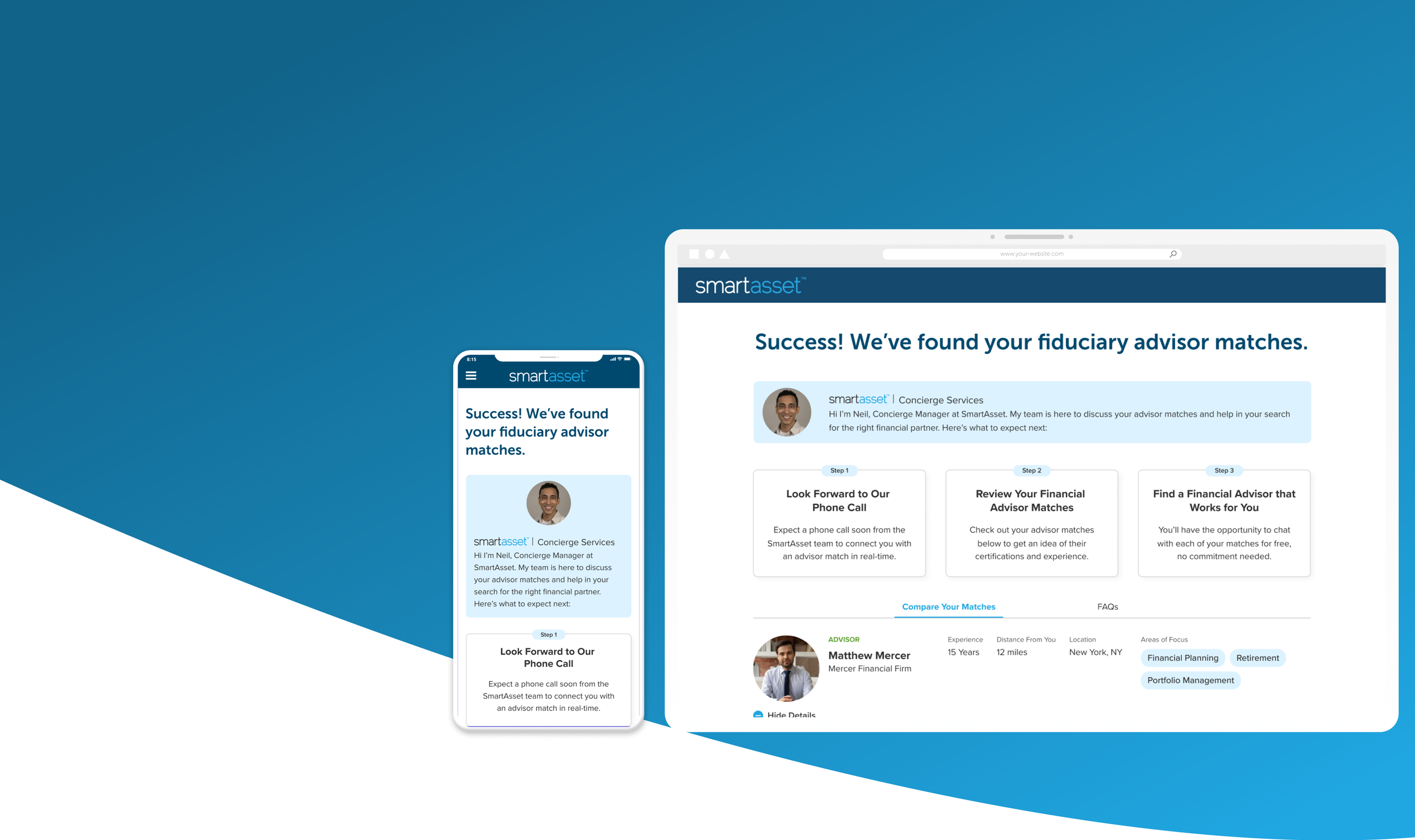
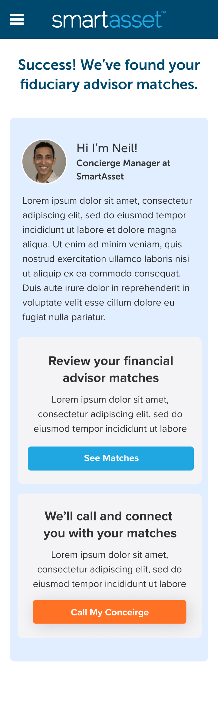
SmartAsset Match Screen
Q4 2022
Stronger investor expectations, better advisor representation
OVERVIEW
The SmartAsset Match Screen is the final page in the core product experience of the company: a quiz designed to connect investors to SmartAsset partnered financial advisors. This page is the first look our investor users have of their matched financial advisors, and the first touch point to the post-match experience: where they are contacted by our concierge team, and by the financial advisors themselves.
Project Summary
Timeline: 3 months (2 week intervals)
Deliverables: Competitive Analysis, Mid/Hi Fidelity Mocks, Usability Testing Report, Handoff Documentation, Implementation
Tools: Figma, Usertesting.com, Optimizely
Target Devices: Mobile, Desktop, Tablet (website)
Team: Myself, UX Researcher, UX Intern
Accomplishments
Lead Product Designer
Increased revenue by $300,000 per month through stronger expectation setting, adding depth to advisor profiles, and redesigning handoff experience.
Better prepared investors for initial calls with advisors, and increased the number of appointments held between user groups.
What is the Match Screen?
The Match Screen is the core digital deliverable that our users expect: a results page of highly personalized, professional, and trustworthy financial advisors tailored to their specific needs. It’s at the tail-end of the full SmartAsset digital experience, and marks the beginning of the interaction experience with direct contact to our team, and our partnered financial advisors. As such, it is the key touch point that can make or break investors’ decision to work with a financial advisor, and serves as the “instruction manual” on what to expect next.
THE PRODUCT

The Match screen has several key features, which we will breakdown during the ideation phase:
Introduction with additional next-step modules;
The financial advisor profiles with key information;
Additional resources to prepare for the advisor meeting.
A Core Deliverable to the Core Experience
The Match Screen serves as the core deliverable of the main SmartAsset experience. It is the first exposure our investor users get of their matched advisors, and is the digital “reward” for taking our 20+ question survey. Most investor users are not familiar with SmartAsset, and learn about our company through ads, then are nurtured by our website on online content to use our funnel / matching quiz. After completing the quiz and receiving their matches (the match screen) the users are contacted by our internal concierge team and their matched financial advisors for their free consultations.
🎯
user sees and interacts with advertisements
🖥
user interacts with website and tailored content
📋
user takes advisor matching quiz
🤝
user is matched with three tailored financial advisors (match screen product)
📞
user is contacted by concierge and has free consultation with advisors
Meet the Users
The primary users for our funnel / match screen we call consumers or investors; users who are seeking out the aid of a financial advisor for their personal financial situations. Within the investor group, there are 4 key segments.
THE AUDIENCE
New Starters
👦
New starters are at the earliest stage in their financial journey. Young, with budding assets and fresh experience, these users are looking to start investing with modest financial goals.
Savings Builders
👩
Savings builders are disciplined savers building upon strong financial resources. With a stable income and structured accounts, this user group works towards larger financial goals.
Wealth Growers
👨
These users are in a later phase of the financial journey where growing capital is the core goal. These users are established, have high financial maturity, and higher risk tolerance.
Wealth Retainers
👵
Wealth retainers are at the latest stage in their financial journey, where they have built a strong amount of capital and want to ensure that it lasts throughout retirement.
A Poor Reward for the Investment
So why did the Match Screen need a redesign anyway? Well, it turned out that after a 20-30 question survey, users had high expectations on a highly personalized, detailed, and robust match screen detailing key information about their matched financial advisors. What they ended up with, is this:
THE PROBLEM

This version of the Match Screen failed to properly set expectations, failed to deliver on the promise of robust advisor profiles, and did not offer anything to aid the users’ post-match experience; three key points we’ll explore in further detail below:
An Unsatisfying Handoff for all Users Involved
The match screen is a major intersection of three different user experiences: the investors, the advisors, and our internal users, the Concierge Team. Since the Concierge Team and our advisor partners are in regular communication with the business, we have a solid understanding of their pain points (thanks to some user interviews and on-site inquiries.) Disinterested and low-intent leads, confusion on the process after they receive their matches and general unpreparedness to talk to advisors were common complaints.
For our investors, CSAT scores and comments indicated the most common issues focused around little to no indication that users would receive phone calls and gathered no meaningful value from advisor profiles. We’ll break down each of these pain points in the following sections.
Unclear Next Steps

The SmartAsset user journey does not end at the match screen, but this is something that it failed to communicate, as the only indication was small copy below the title, which was easily lost in the page. Most users were unaware and caught off guard of the follow up calls from the SmartAsset team and matched advisors, resulting in a poor experience all around. Investors were overwhelmed with perceived-to-be spam calls, Concierge members dealt with frustrated investors, and advisors did not receive high-intent investors as expected.
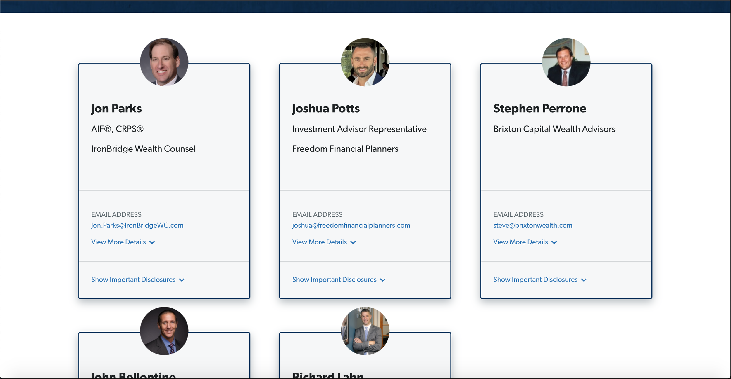
Limited Advisor Profiles
Original advisor profiles lacked any substantial depth, leading to a major source of disappointment for our users. And though there was some more detail in the dropdown of the profiles, these key elements were hidden by unnecessary interaction, an interaction many users did not engage with. User interviews and customer satisfaction comments (CSAT) revealed that users expected profiles with stronger details, stronger personalization, and a better insight into their expertise and fee structures.
Lack of Post-Match Support
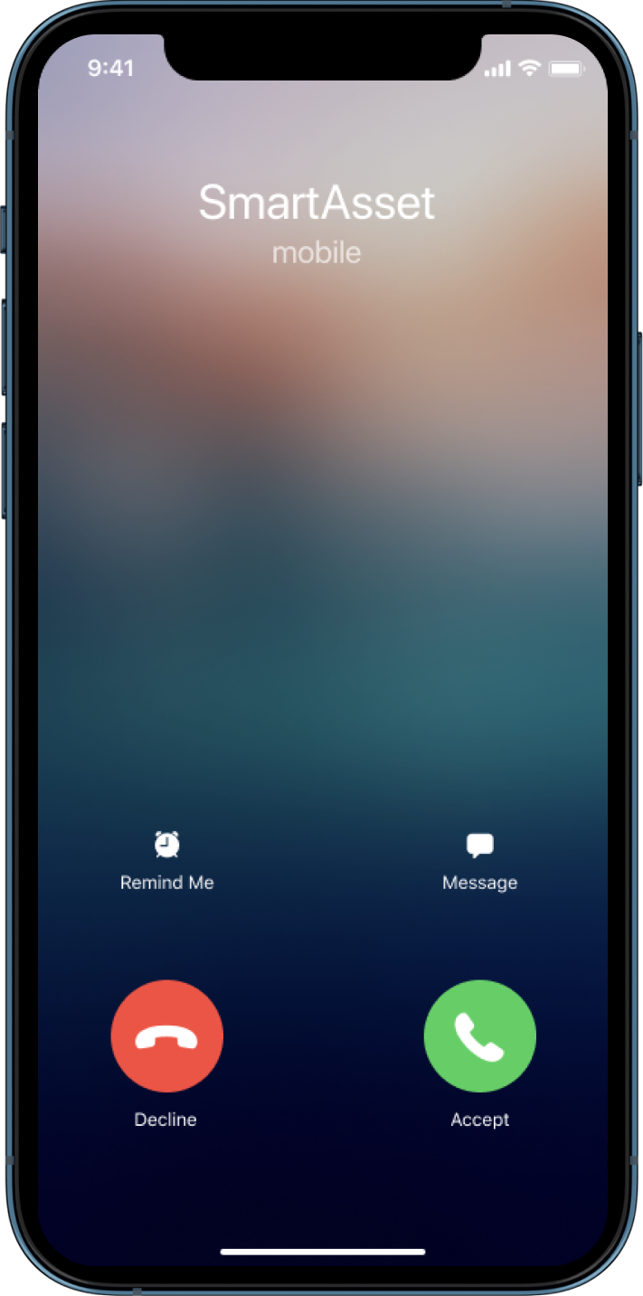
As users landed on the match screen itself, they were left fully unprepared for the contact, chat, and upcoming consultation with their advisors, if they even knew about this step at all.
With an incredibly minimal indication of a call, and no content to help prepare investors, many of them were blindsided by an advisor or concierge call. According to CSAT entries, there was a pervasive feeling of dissatisfaction among our users, owing to the fact that no effort was made in bridging the gap between the on screen and off screen experience.
Our Goal: Modernize, Optimize, & Contextualize
With these major pain points identified and business goals given, our project had its plan of attack and guiding question solidified: How might we better fulfill the promise and expectation of our matching experience to our consumers and advisors?
Provide clearer insight for the next phase of the process
Better demonstrate the value of the advisor profiles
Supply our users with additional “reward” and “value” to match the level of time and commitment invested in the matching quiz.
Building our Redesign pixel by pixel
THE EXPLORATION
Exploring How Direct Competitors Fare
With a strong idea of the main pain points and goals, our next step was to get some inspiration and understanding of what exists in the competitive space. We took a look at a couple of our main competitors, and how they prepared their investors and promoted their advisors.

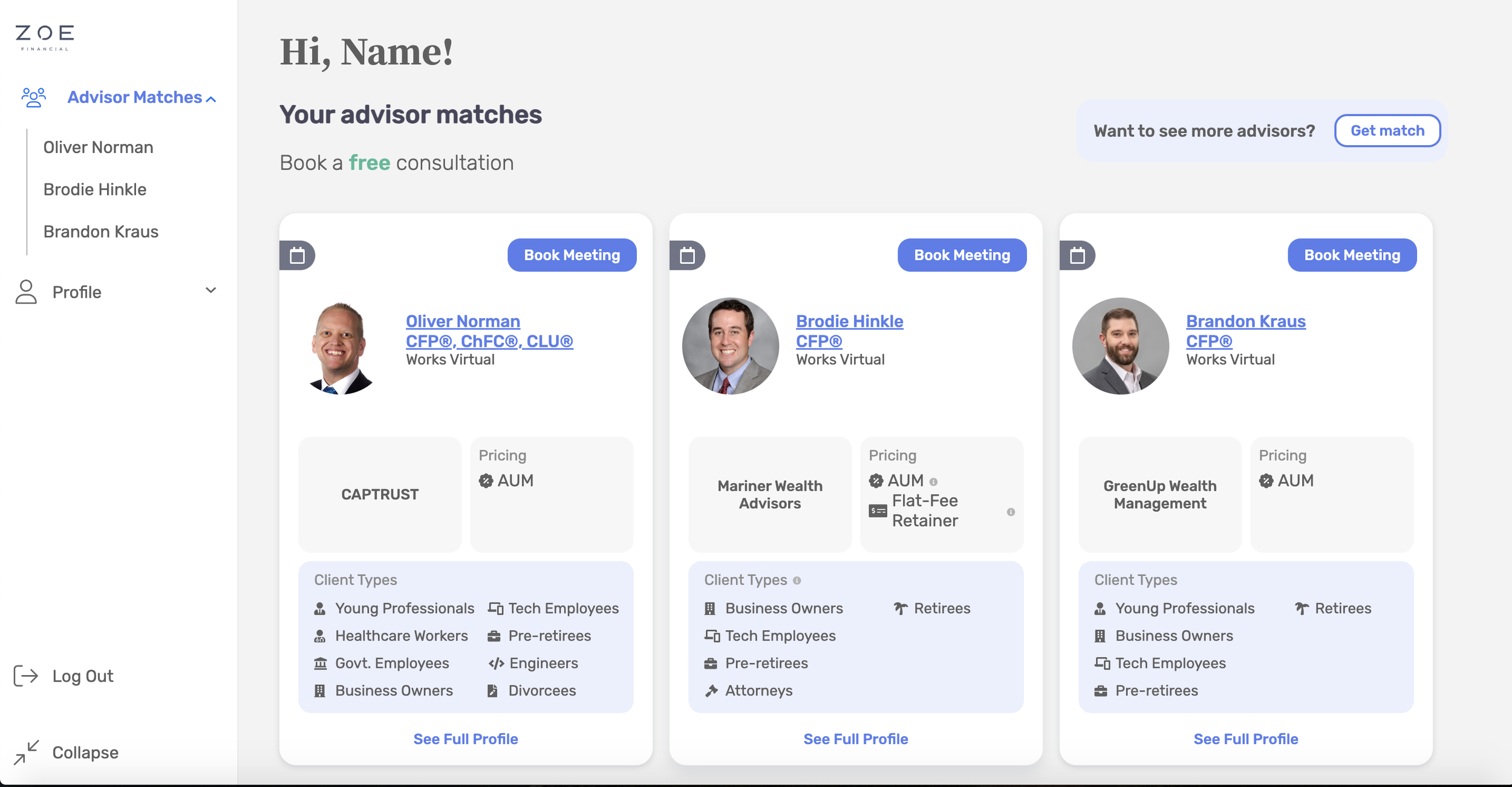
Zoe Financial’s advisors have stronger preview and full profiles.
Smartvestor highlights a stronger comparative experience.
From a look at these profiles, we gathered that some competitors really tried to highlight a comparative experience between the various advisors, while others highlighted their client types, pricing, and other relevant information that advisors found valuable.
What Inspo Do Comparative Products Offer?
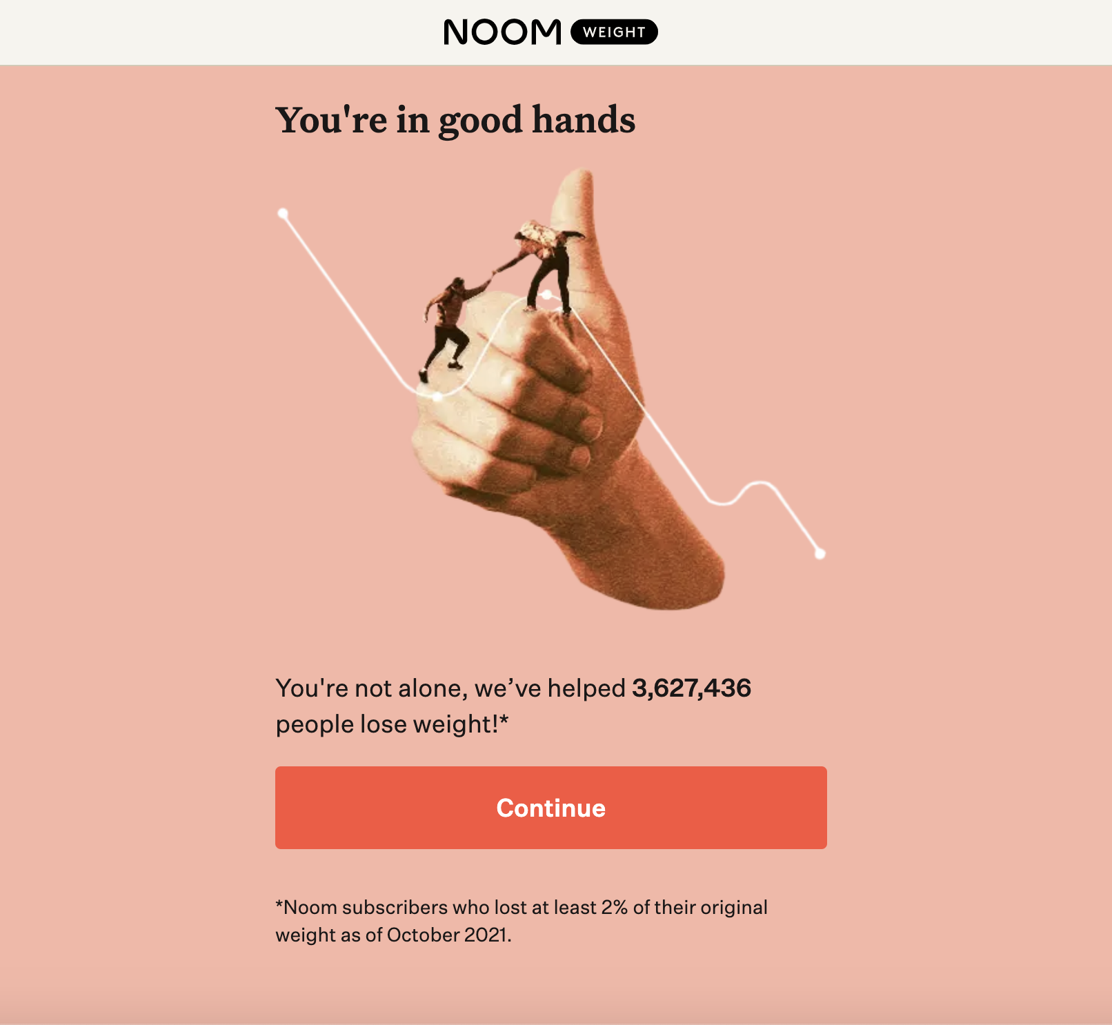
It’s a good rule to not overlook the impact comparative products can have on our own user experience. Looking at comparative funnels or quizzes where users are expected to provide a lot of sensitive information, we can identify some key elements. Some funnels do a great job of humanizing the experience by adding a face and name to the digital product, like Lemonade. Others, like Noom, really support the experience by providing additional insights, articles, and facts to add value and credibility to the experience.


How Might We Better Introduce Next Steps?
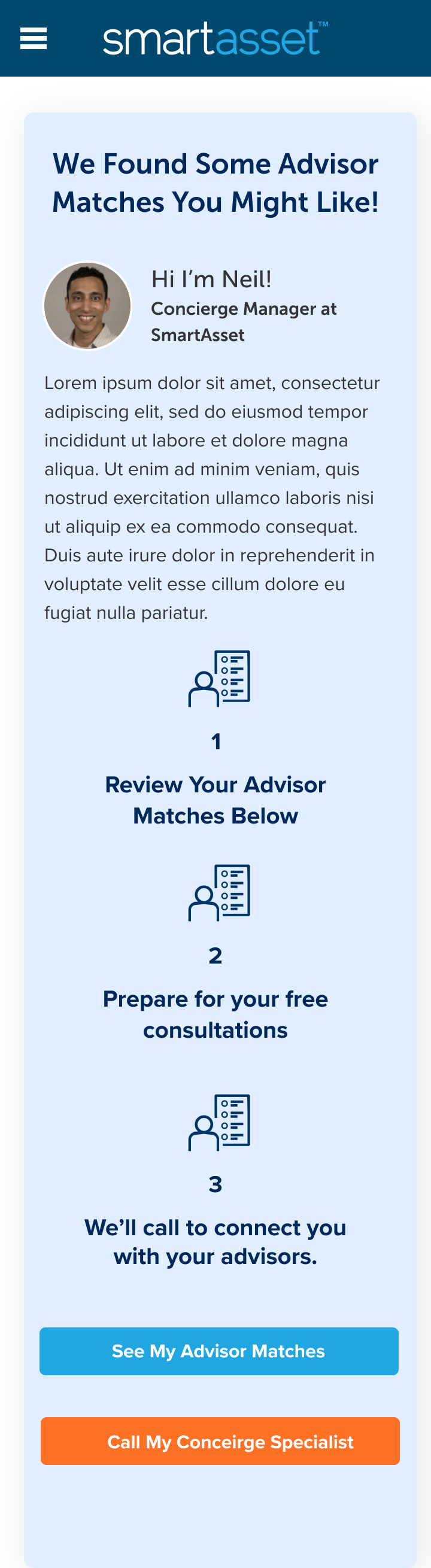
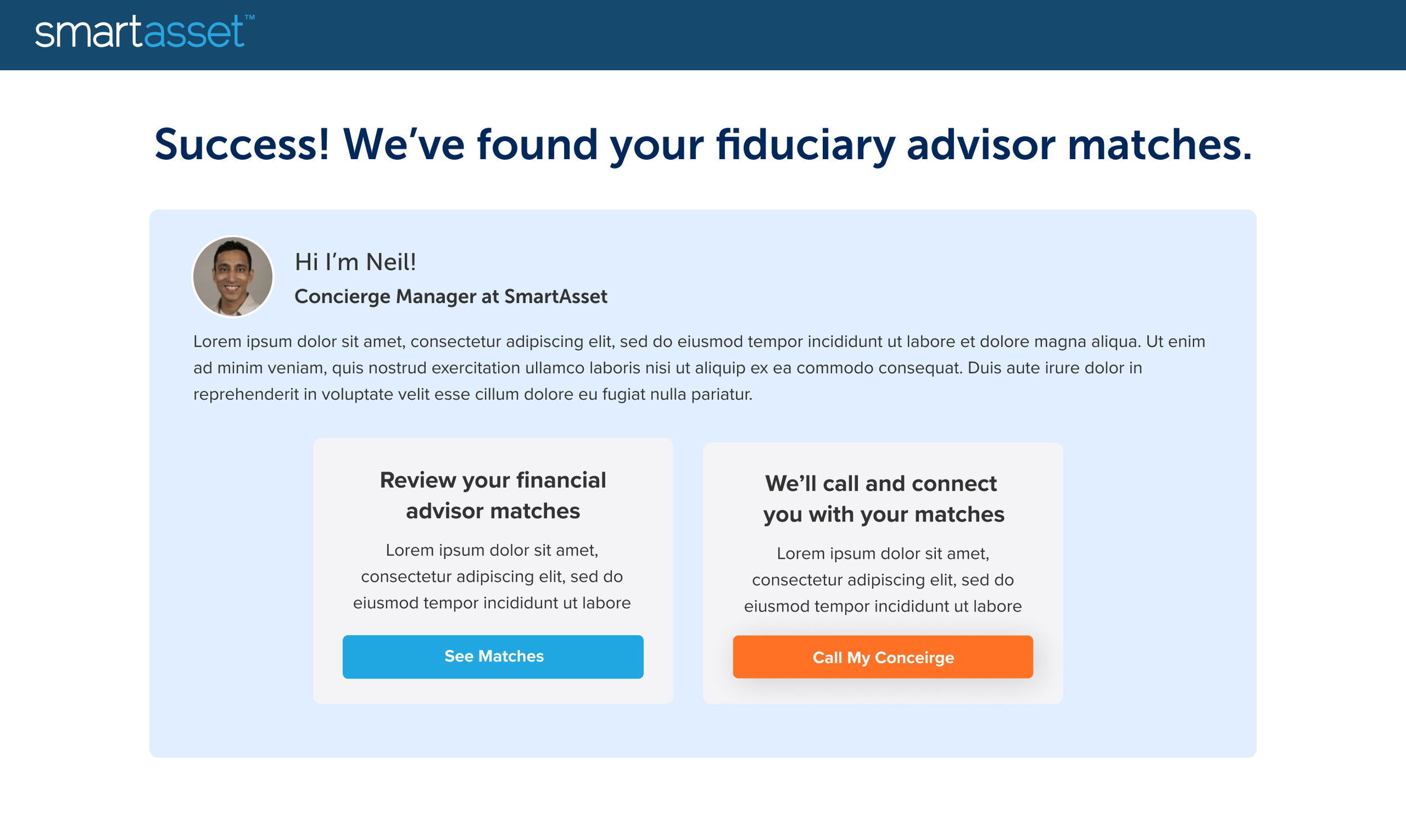
So first things first, I had to address the main point effecting all our user groups, the lack of context around next steps. Inspired by Lemonade’s personalization, I thought a good strategy to explore was a personalized introduction panel preceding the advisor matches, using our Concierge Manager: Neil.

Iteration 1: The First Introduction Module
While a good start, there was some obvious limitations, a major one being real-estate for desktop. Owing to the fact that 60-70% of our website audience is mobile, and the background image not matching our brand trajectory, the next step was to eliminate the space, and restructure the desktop page from the ground up. A larger content well, and stricter adherence to the 8-point design grid helped me find a more natural state for the flow of element spacing.

Iteration 2: Full Screen Redesign with Introduction Module

Now with a better design space to play around with, I started experimenting with different introduction iterations; some incredibly detailed, some with direct CTAs to contact Concierge, and some simpler variations to compete less with the advisor profiles, all while simultaneously optimizing for mobile.
Iteration 3 &4: Detailing Next Steps

Playing with 3 steps, iconography and CTAs, though was really competing with main content.
Exploring cards in ideation, though the introduction was still heavily dominating the viewport
After some verification of ideas through user testing (which I’ll break into more in the next section), I finalized on an introductory concept using a top banner and introductory cards. This design would effectively humanize the experience with Neil’s Concierge banner, and provide an easily digestable breakdown of what happens next using the card format. The card format also fit better with branding elements existing on other parts of the site, so this should be a familiar design to our users. The card format also fit right into the mobile experience (despite tech constraints limiting mobile interaction.)

Iteration 5: Simplified Introduction with Next Step Cards

The three step information focused style was supported through user testing, although tech constraints did limit our mobile optimization to reduce viewport space.
Highlighting Advisor Value

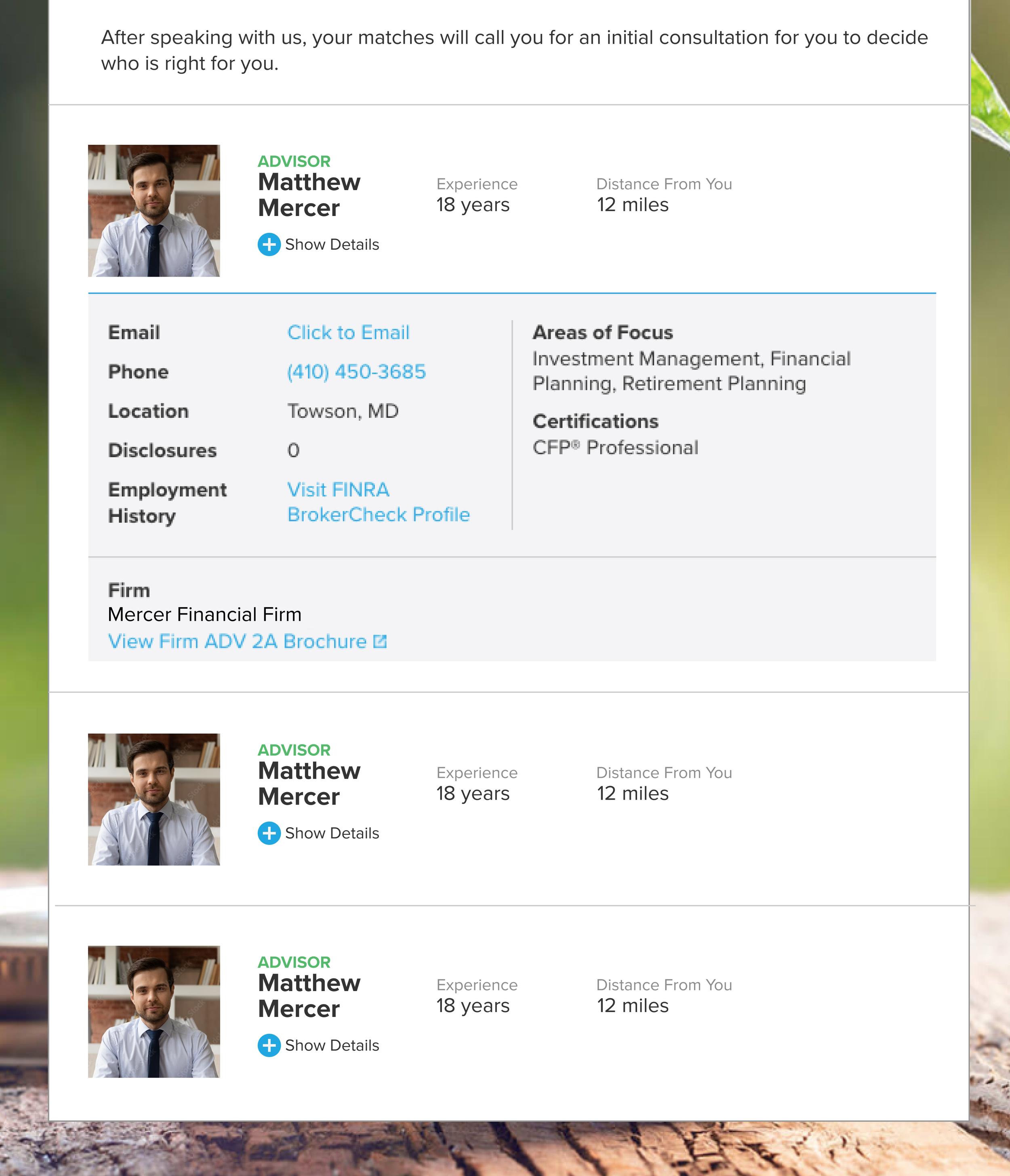
Next we wanted to improve the advisor profiles, but there was a catch. Due to back-end limitations and shorter timelines, we could not get any new information for the advisor to share in our profiles, so the updates were limited to what data and content each profile already had.
So, we began exploring profile redesigns with two key priorities: highlighting the most valuable information, and humanizing/personalizing the advisors so they’d be more approachable. Understanding how our competitors highlighted these key elements, and paying attention to CSAT comments around advisor specialities, allowed us explore a couple of different design avenues.
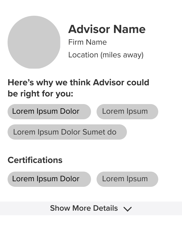
Iterations 1 & 2: Expanded Advisor Profiles
My first designs wanted to make the UI friendlier, but highlight the primary key components

Some iterations included more detail, including a description of the advisor themselves to humanize and endear them to the user. This unfortunately, was limited by our ability to collect that data.
Advisor expertise and specialization was the #1 most requested detail our investors wanted, and thankfully, turned out to be the one detail advisors also wanted to highlight on their profile. My original idea was to maximize the advisor profile details, and still highlight a comparative feel and experience of the matches, but after some usability testing, that was deemed too distracting and duplicitous, and was not something we could reconstruct through mobile.

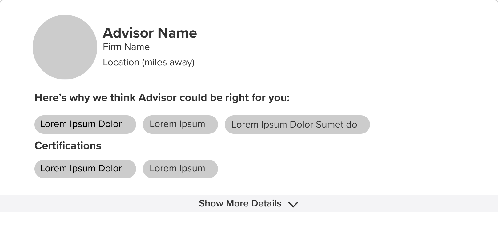
Iteration 3: Comparative Preview Cards
Unfortunately, this comparative experience did not test well on usability testing, and was limited by both developer and compliance restrictions
With usability testing results guiding refinements, I eventually settled on a simple design integration that still highlighted the areas of focus and made the design friendlier, but generally lost the added complexity of previews, certification explanations, and the comparative experience. Unfortunately, though not my favorite design, it tested better, and could pass developer and compliance limitations.
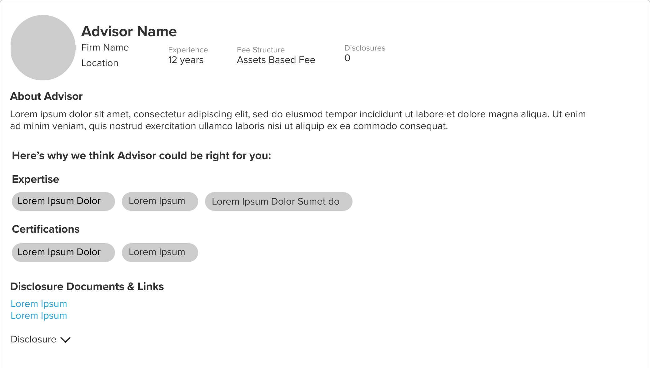
Iteration 4: Simplified Expertise-oriented Profiles
Though more simple in design than I initially intended, this final version was validated through a round of usability testing, and sent on our platform on an A/B test.
Core Refinements Made, Now What Can We Add?
With the core elements refined and thrown into the wild for testing, it was time to see what we else could we add. What other factors could we provide to help users in their post match-experience?
Originally, the only content that the Match Screen provided was an FAQ section that answered a few key questions. there was only one other real piece of consumable content, buried under dropdowns and copy.

Analysis of CSAT responses showed that personalization plays a key role in optimization, so my initial attempt was to use personalization for tailored financial product recommendations. Unfortunately, this was another suggestion that got blocked by tech limitations, but we were able to eventually roll this out as a separate, specific integration.

Iteration 1: Personalized Product Offers
These designs would go on to form the basis of our 25K offerings project, a separate initiative I can explore in another case study.
With the recommended products, siloed, the next best step was to see what general offerings we can provide to our users. Since users generally find material on getting started with an advisor valuable, we could utilize popular evergreen content articles. Pulling from experience working with the editorial team, and utilizing what we learned from our blog experiments, I decided on a content card implementation for the articles, framing them as additional material for the users interest. This design tested well in usability, and we rolled it out with the rest of the updates.
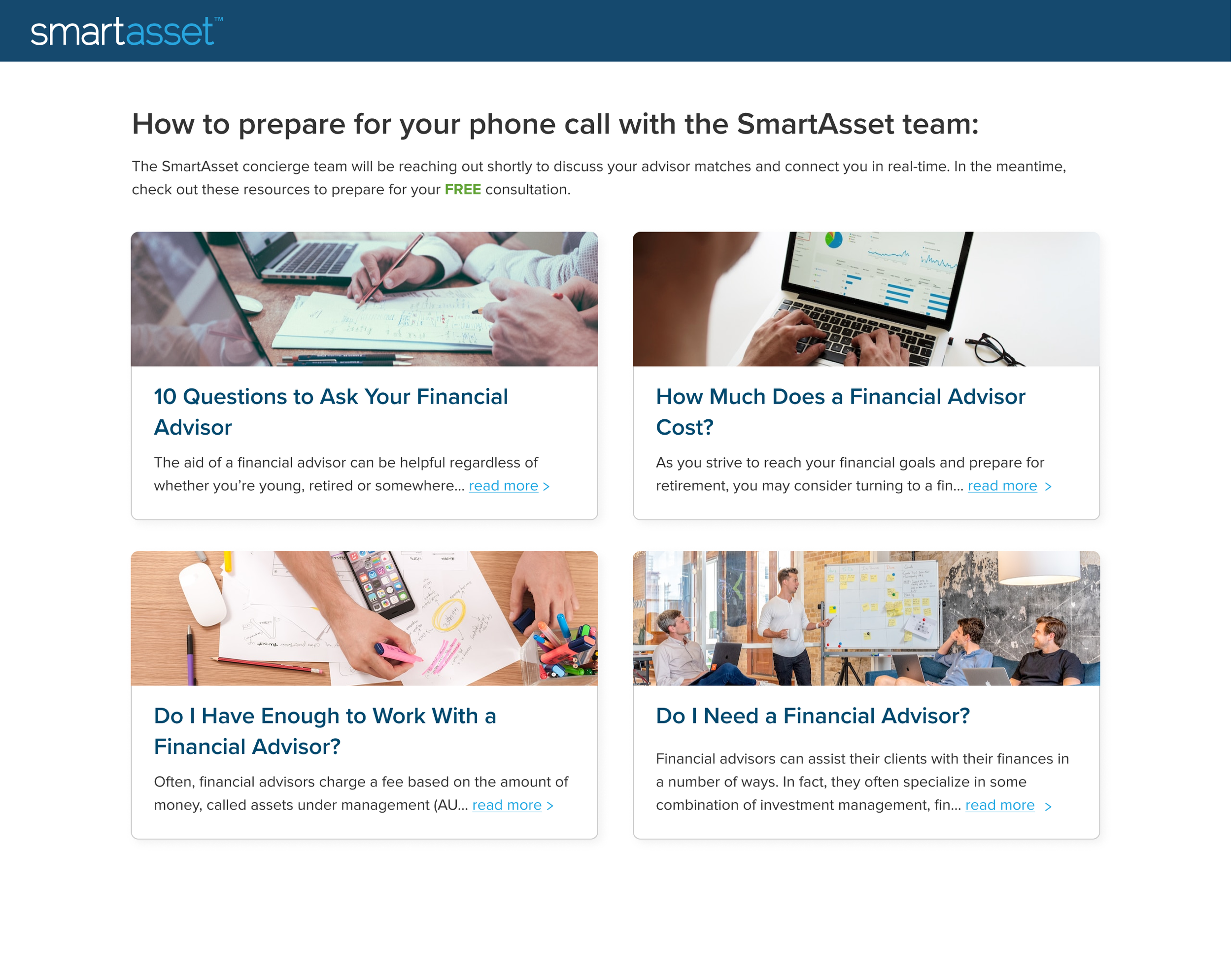
Iteration 2: Consultation Guides to Get Started
Dual Testing and Push to Launch
THE DELIVERY
A Dual Testing Strategy
Testing throughout this project was high velocity and oriented to prove our hypothesis and gather stakeholder buy in on each main component of this redesign. Stakeholders wanted testing and improvements made as soon as possible, hoping to see results within the quarter. Due to this constraint, the team decided to approach the designs in a dual testing matter: Usability Testing and In-Market Testing.
Usability Testing: Verifying our Concepts
Usability Testing was done remotely using Usertesting.com. This handy tool made it easy to get rapid feedback on multiple A/B user tests on a same day basis. This allowed us to refine concepts quickly, and within the 2 week design frame, deliver something that we had more data and feedback to support.
👤
5 Users per section (15 Users total)
💻
Usertesting.com, unmoderated, recorded
🗒
~15 questions, multiple question types
🕒
~20 min per session
Our main insights from usability testing for all the cumulative sections were:
The introduction was valuable and important to the flow, but should not distract too much from the main content.
The more simple and clear the content the better. Comparative experiences or detailed information was not as important to the overall experience yet.
Additional supporting materials were appreciated, but not prioritized or valued. In some cases, these can cause more of a “homework” effect, where users felt they had to use the material.
For mobile users, the rate of scroll did not have a negative impact on the experience, however the experience can still continue to be optimized.
These insights proved valuable in optimizing the experience, and gave us a clear roadmap on how to properly rollout (and improve post rollout) the experience we’ve spent time and effort crafting.
In-Market Testing: Launching with Our Real Audience
For In-Market Testing, we utilized Optimizely, a tool that allows for quick A/B testing and front-end changes without utilizing tech resources. Essentially, we were able to set up A/B tests of the submitted designs against the original, and see which would end up with higher overall metrics for the business. In this scenario, we were looking for more pick up rates (consumer picking up the phone) and higher amount of users setting meetings with their advisors. This was factored into the primary KPI: revenue per lead, or RPL. Overall, Optimizely allowed us to prove the effectiveness of our designs in market and push for more tech resources.
👤
~30k - 40K users to reach statistical significance
💻
Optimizely, live testing on website
🕒
2 - 3 week timeline for testing
In-Market testing revealed key insights for us as well:
The redesigned sections resulted in about a 3% total increase in RPL (revenue per lead) totaling around $300,000 in additional monthly revenue.
The design impacts were stronger for desktop users than mobile users, pointing for further opportunity for optimization.
Investors were generally reporting to be better prepared and excited for their advisor consultations.
Overall, the dual testing strategy proved to us and to stakeholders the effectiveness of our redesign changes, so we could push for implementation with full development team backing.
Developer Handoff and Implementation
So with testing complete, proven RPL increases, and stakeholder support, we could prepare designs for implementation.
For this project, we worked with a third party developer team called Kanda. Because there were third party, there was additional profile breakdowns necessary for the developers to understand which elements we were changing, and how the advisor profile types worked. This required some collaboration with certain Product Managers and Sales members, to understand how profile classification on the backend.

I had to be very direct on the breakdown of the four advisor types (direct, firm, network, and robo) and used Figma’s comment feature for interaction/variation breakdown.
Besides the profile breakdown, other interaction points and changes to experience were highlighted, all while utilizing Figma’s auto-layout to highlight spacing and margin changes of the page and of individual elements (utilizing the 8 point grid method from our design system.)
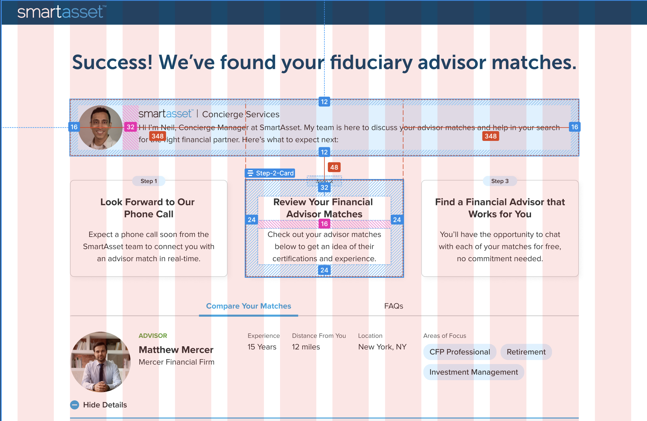

Utilizing auto-layout has made our handoffs much more effective, as we can detail spacing, margins, and sizes to a pixel, ensuring high quality design and flexible responsive products that work for multiple device sizes.
it’s good to keep in mind that a developer handoff should also be treated like its own user experience. I want to be able to give the developers every advantage to get their job done, all while remaining close at hand incase they need anything clarified. All that careful work culminated in the eventual design, handoff, and launch/ full integration of this newest , user-friendly, and profitable version of one of SmarAsset’s core product experiences.
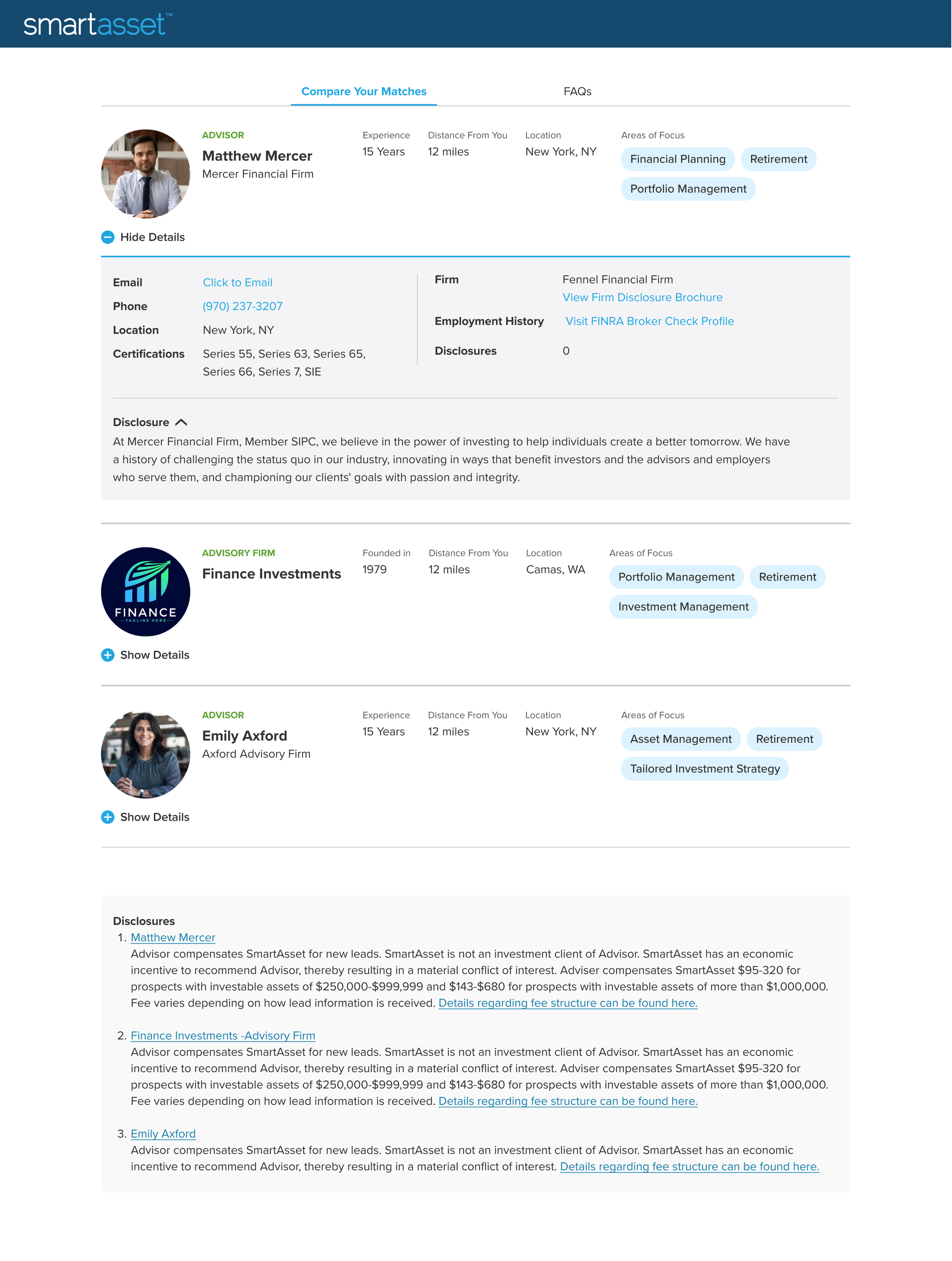
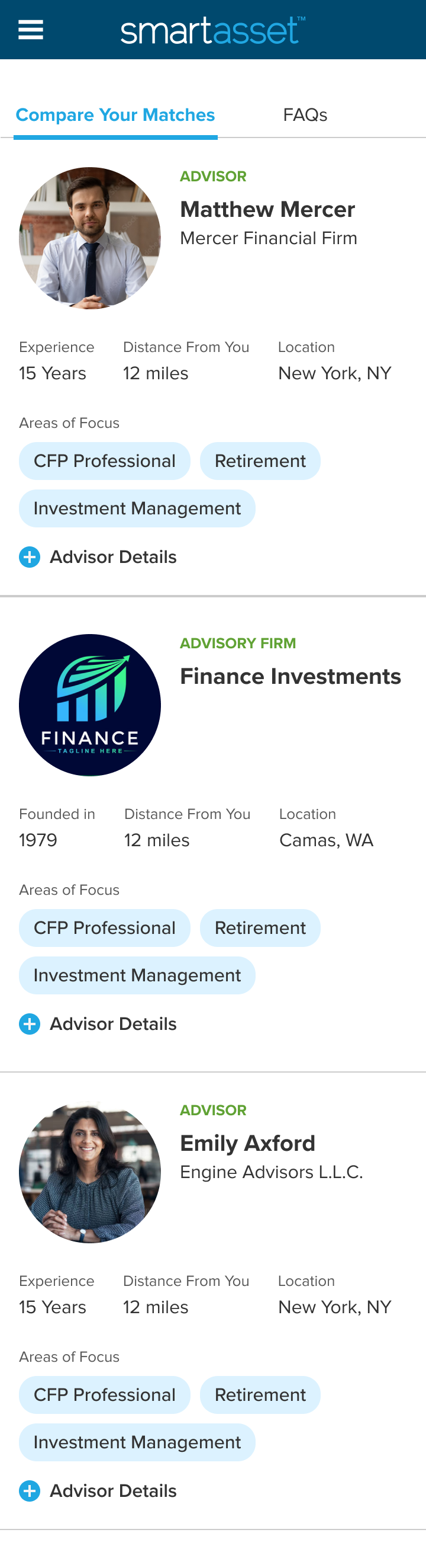
The Final Product
Take a look below at the Match Screen in action!
THE FUTURE
What Comes Next?
There’s plenty left to explore in the future of the Match Screen. This redesign was incredibly limited by developer resources, to the point we could only change what already existed in the backlog, not utilize new information. The project itself was also a push for developer resources and stakeholder buy-in, and we were able to prove the effectiveness of our product with testing in and out of market.
That being said, there’s definitely plenty of room for growth, and more opportunities I wish I had the time and resources to explore. Some of these include:
Further mobile optimization of interactions
More detailed and in-depth advisor profiles with new information
Better integration of supporting and personalized content
A better way for users to utilize the match screen as a personal hub for their advisor matches, not a one-time use page.
Continued high-velocity hypothesis testing to verify and back our design ideas
I am still leading optimization and experimentation efforts of the Match Screen at SmartAsset, and with the additional stakeholder buy in we received through this project, more data to collect, and new ideas to explore, the Match Screen may evolve into something of full fledged digital experience in the future!